


Requirements
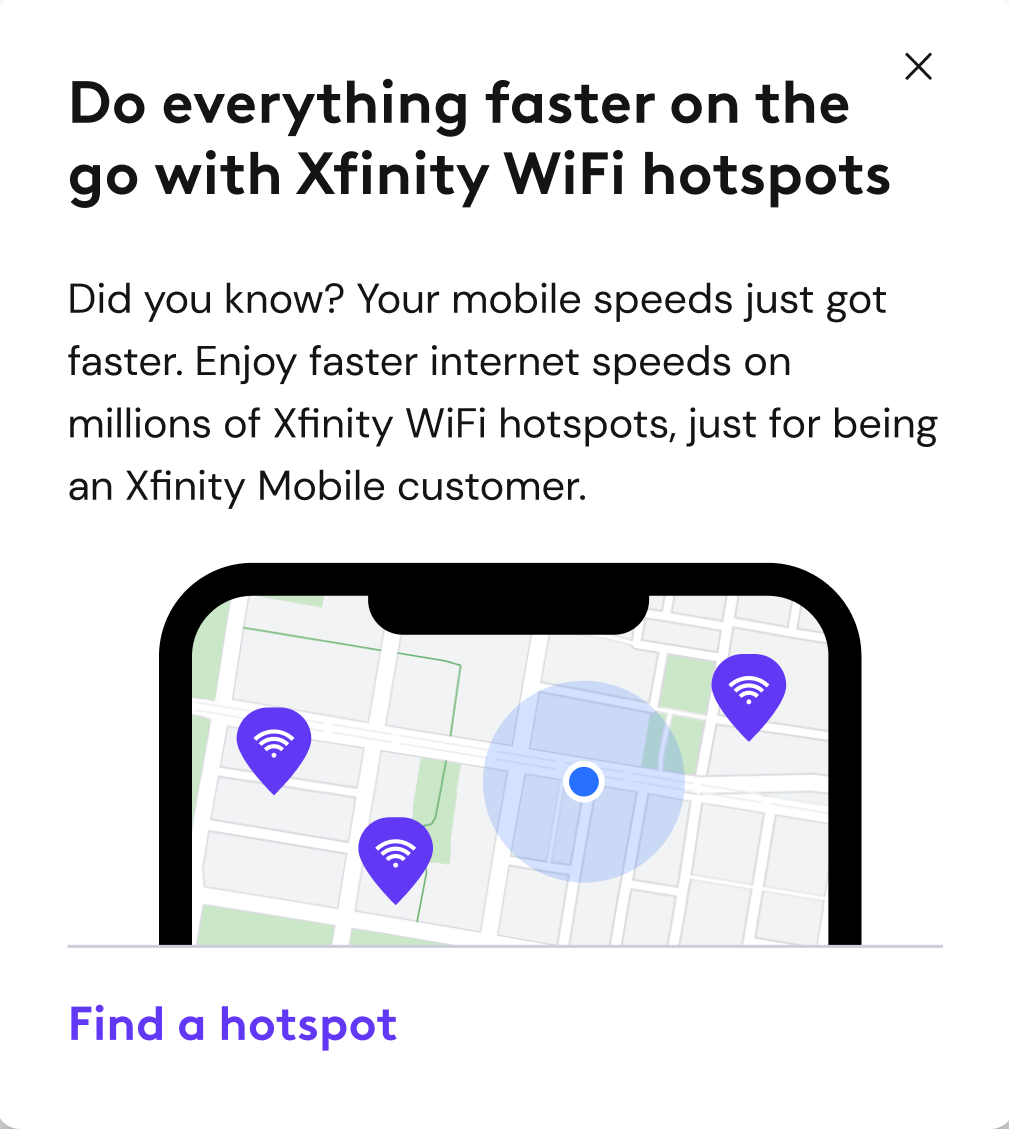
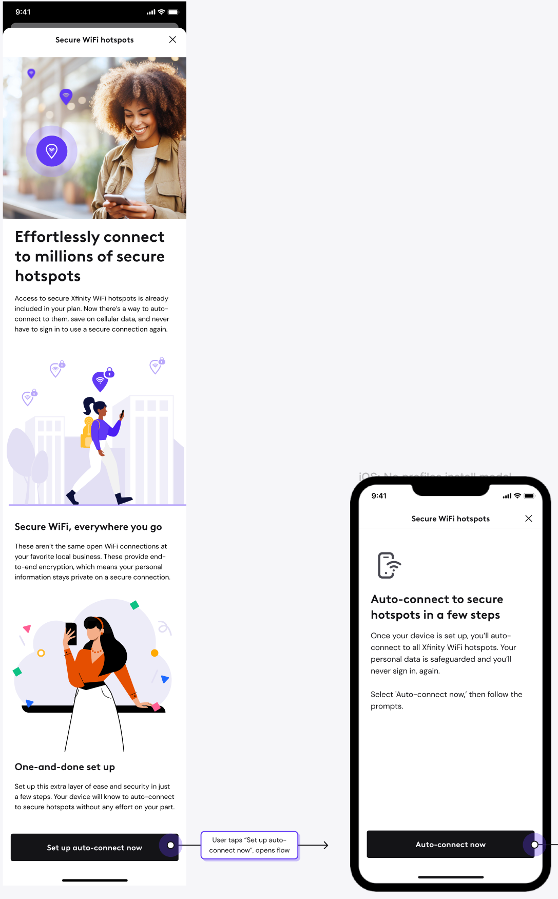
Product's ask was to develop a suite of screens announcing the arrival of a natively built Xfinity WiFi hotspots flow as it was previously its own app. As Xfinity's apps converged into one, we built an experience that allows the user to auto-connect to millions of secure WiFi hotspots in just a few steps. Importantly, this would allow their device to auto-connect to connections with end-to-end encryption. The messaging needed to be an introduction to an innovative experience that was previously cumbersome.
Content strategy
Knowing that security and staying connected is top of mind for users, my content strategy was two-fold: touch on the simplicity of setting the feature up, and letting the user know why Xfinity's secure WiFi hotspot network is safer than public WiFi. It was important to develop content that simplifies a process that's technical on the backend, and not bury the user in industry terms that don't mean much on a surface level. The other challenge was how to position the content so the customer will take action, without too much hesitation or cognitive load.
Delivery
Rather than using "install," the industry term, I used "set up." Rather than mentioning profiles, another industry term, I focused on the benefit of taking action, rather than the weight of technicality. The feature is sold as effortless, safe, and easier than ever to use.
While the flow was built early in 2024, the product announcement was released on July 1, 2024. In the following two weeks, it recieved 4.3 million impressions with a 13.6% click through rate. 568,020 users took action to learn more and set up their devices to auto-connect.
Requirements
Overview cards are shown to the user when opening the app. The only thing that may come before them is an alert about their service, or a product announcement, not shown again once dismissed. The overview cards stay for months at a time, and highlight ways in which customers can get the most from their plan and services. From looking to drive more interaction with family settings to announcing everything is faster with Xfinity Mobile, the cards showcase messages delivered in few words.
Content strategy
Less is more. It's important from a content perspective to have mastery of the product, so the end goal can be distilled into as few words as possible. Being minimal also takes translation into account, as much of the content is translated into Spanish and Italian. Both languages naturally translate word for word longer, taking up more design real estate, so every word matters. When writing call to action buttons, I ensure the words take the user to the place that's expected.
Delivery
Using a content first approach, I work closely with our visual designers from kickoff to delivery. Having that synergy allows us to work proficiently, and create great design.

Requirements
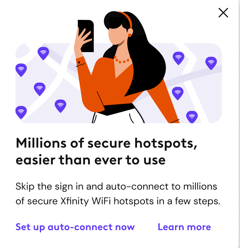
With app convergence a priority in 2023, we were tasked to design a flow that allowed a user to effortlessly auto-connect to Xfinity WiFi hotspots, from within the core Xfinity app. Connecting to hotspots previously existed in its own stand alone app, which was sunset in 2023.
For this new experience, users could "install profiles," allowing their device to auto-connect to millions of secure hotspots in a matter of seconds. Industry terms such as "install" and "profiles" were initially required, and content strategy was executed off of these must-haves.
Weeks before delivery, design proposed a content rework to make the flow more straightforward, losing the burden of tech terms. It was also announced that the secure network we were connecting users to would be renamed from 'XFINITY' to 'Xfinity Mobile,' and all references to a specific network needed to be reconsidered. In addition, months after the build an API response showed an inaccurate error if a user wasn't in range of a hotspot while setting up their device. Without a heads up as to what could happen, users were abandoning the flow when in reality, they could continue and successfully enable the feature.
Content strategy
I wanted to reduce cognitive load and confusion to the user by not mentioning the word "profile," or using the term "install," which often has negative connotations of something that takes up space on a device. I focused on what the user will receive once they take action, rather than what the technical process is to get them there. The screen headers and CTAs were also reworked. To overcome the potential error, we needed a content strategy that was more of a 'heads up' and not a dead end.
Delivery
A quick and straightforward flow that provides the benefit to the user each step of the way. The blue callout box acts as a forewarning to the user, letting them know a false error might occur, but to not get discouraged. As any good designer knows, iteration is the secret sauce to great design. Even if it's in the final hour, or six months down the road.
After content strategy updates
Requirements
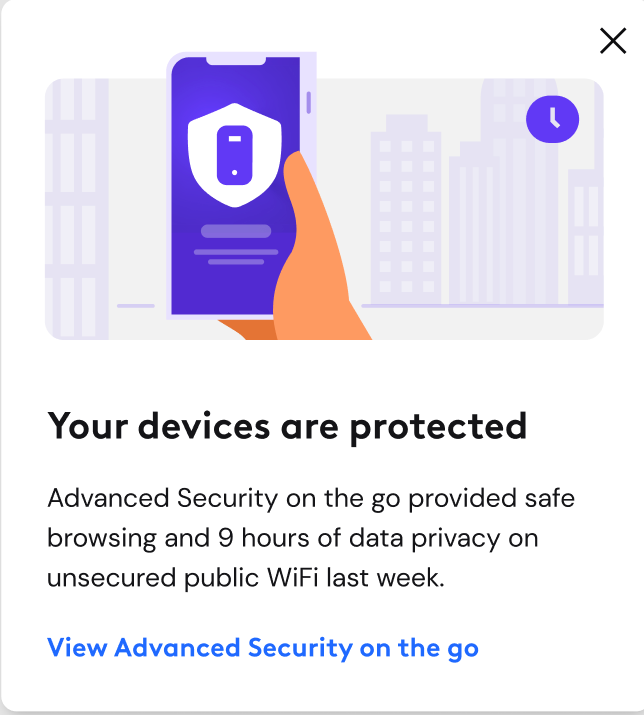
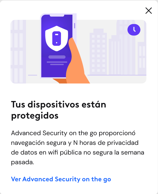
Advanced Security on the go provides protection for your device on unsecure WiFi networks - think airports or coffee shops - by keeping your data protected via end-to-end encryption, and blocking malicious websites. Android users were dropping out of the flow at an alarming rate of 84% after the first screen. They were also dropping out of the flow when asked for VPN permissions while using the app. The ask was to revise the first screen in the flow, and introduce a modal when users retreat from gaining VPN permissions.
Content strategy
Language in the info disclosure modal had been written by engineers, designers, and the legal team. While I had to adhere to a portion of the legal language, I wanted to reinforce the feature's value, and separate the informative from the actionable copy. I also reworked the "I agree" CTA so it didn't read as a legal binding.
The strategy for the VPN permissions failure modal was to emphasize the users privacy and security on the go, with as little copy as possible. With the sentiment that people don't read, how could I harness the headline and the blue callout box to bring them over the finish line?
Delivery
With a content first approach, I challenged the UX team to see if we had a way to condense instructional information that wasn't shown in body copy, which users often glaze over. The use of the blue callout box was born. The headline was also an improvement, one that gives the user confidence to keep moving through the flow. Two headlines were created for the purpose of A/B testing.
For the VPN permissions failure modal, the content was kept minimal, opening with a headline that promotes everything we want our users to feel - total peace of mind. The blue callout box was used again providing clear directions on how to turn the feature on. After two weeks of implementation, the success of the VPN failure modal was evident and made permanent in the flow with an astounding 36% increase in conversion.