Xfinity Mobile Frontline porting errors
Requirements
Porting means bringing your phone number from your current phone carrier over to your new carrier. With activation being the number one reason customers call Xfinity Mobile, arming agents with easy to use support is critical. The original error content was written by developers, using language unintuitive and complex. The rewrites would empower agents with real solutions and in turn, create happy customers, confident in our brand, and service.
Content strategy
Troubleshooting over the phone is a challenge in and of itself, so language had to be kept simple. I was also considering English may not be the agent's first language. Agents are based in The Philippines, Romania, Honduras, and the United States. With every error, I put myself in the agent's shoes to consider whether these highly technical issues made sense to me. If they did, I felt the rewrites were a success.
Delivery
65 errors were rewritten, working closely with engineering partners to better understand the solutions. This project had been in the backlog for 3 years prior to picking it up.


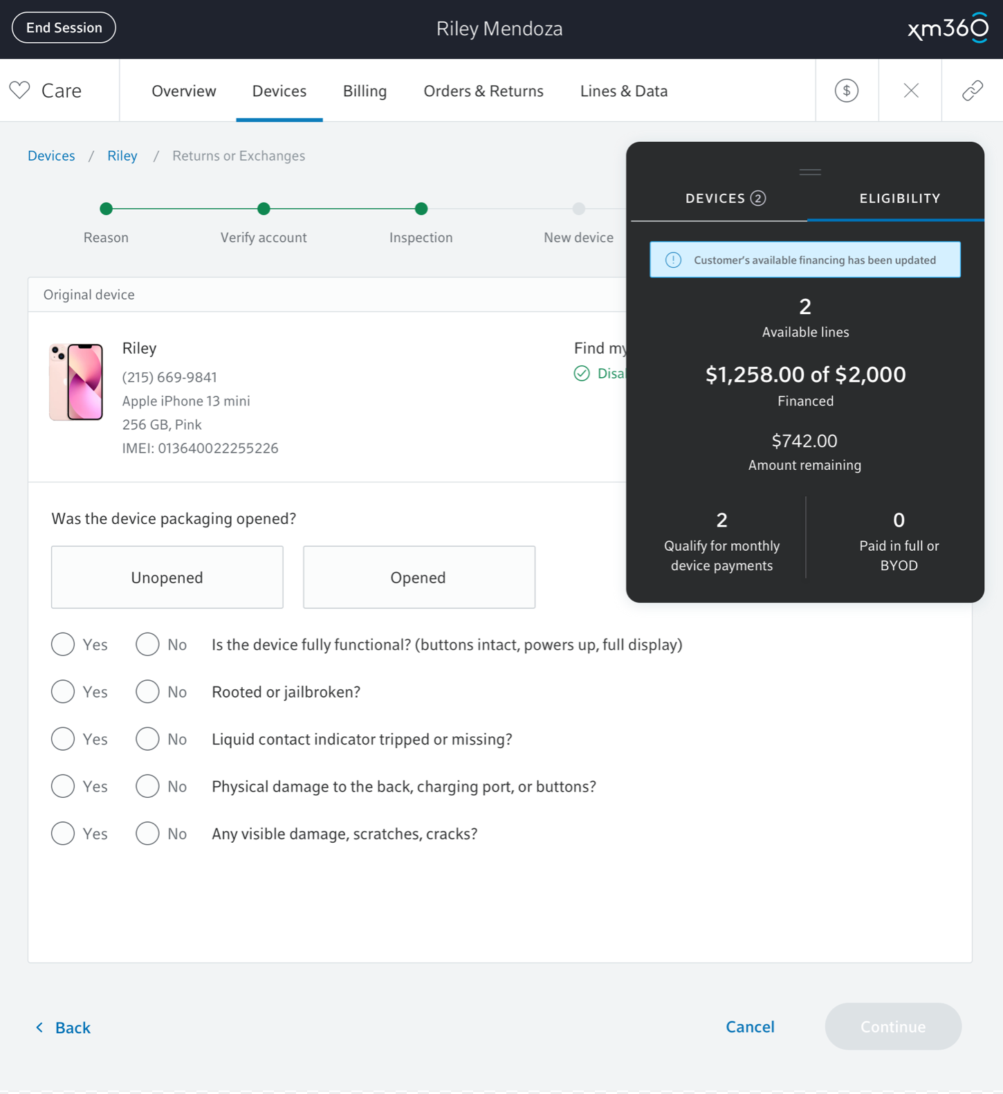
Xfinity Mobile dollar financing widget
Requirements
Xfinity Mobile Frontline agents are faced with high pressure sales situations every day. Customers may request multiple lines, or the newest phones, but their allotted financing may prohibit the transaction from closing. The agent is also faced with doing math 'on the fly,' having to calculate what the customer has purchased, and how much is left against their financed limit. We needed to design a widget that gave them instant, up-to-date financing information, so the conversation can continue and the sale can close.
Content strategy
The widget needed to contain six key data points. The content needed to be scannable so the agent can focus on the conversation, not the calculation of numbers. I condensed what had been spent, while singling out what remains. The callout box at the top kept the agent confident in knowing once a device had been added, this information had been updated.
Delivery
We chose a black background to ensure the information popped from the UI. Upon release, agents loved the update, making calls run smoother than ever. That made me happy.
